The drawings for this series were done on the
scraps left over from cutting down 30” x 40” sheets of cold press 2 ply Strathmore
paper down to 11” x 17” comic art page size. This was before I discovered the
pads created especially in that size. The leftover strips were 4 “ or so wide,
perfect for drawing comic panels on, I mused. (to be continued)
VAMPIRE PENIS 2
VAMPIRE PENIS 1
I’m going to be post 1 panel per day of a series of drawings I did a year or 2 ago. These drawings are part of a narrative I call “Vampire Penis” for reasons that will become obvious in the coming days.
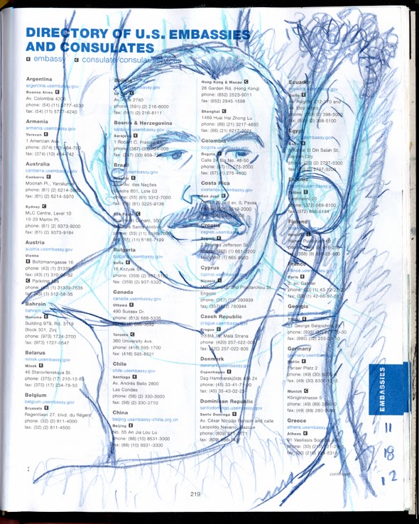
This is the last page and the end paper/back cover to
the 2013 American Express Date Book, which I repurposed as “The Daily Dick”
sketchbook. Goodbye 2013! I’ll miss you.
It is with bittersweet gladness that I post the
next-to-the-last blog for “The Daily Dick”. Basically, these are the last 2
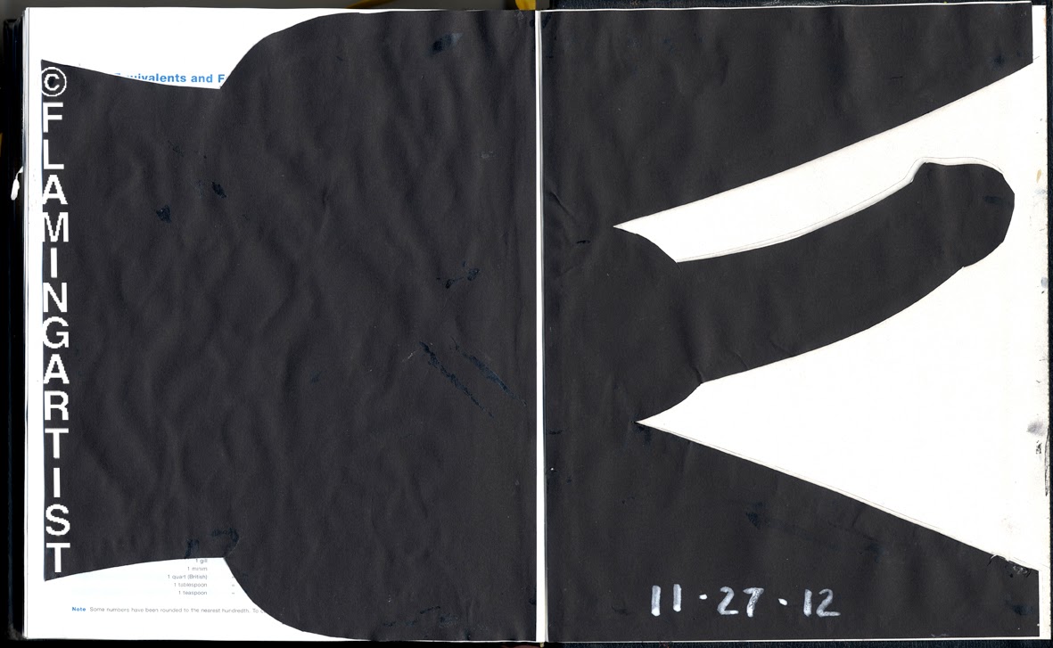
pages in the 2013 American Express Appointment Book. Both pages in this folio
double page spread are covered by black paper glued atop them, then cut into
again in the shapes of hips and legs/penis, showing the page/end paper beneath.
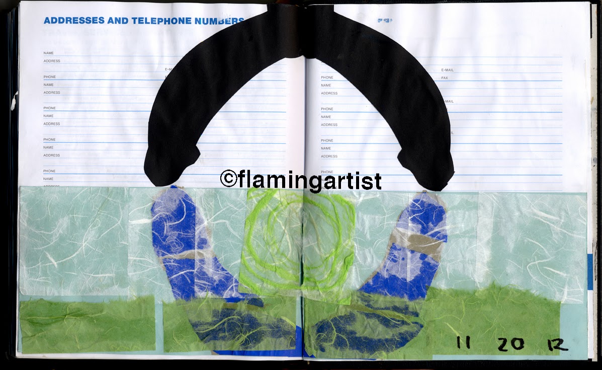
“Let your penises do the walking through the yellow
pages”. I was working with cut paper collage again, using expensive scraps of
paper purchased in variety packs from Swain’s Art Supplies in Glendale,
California, USA.
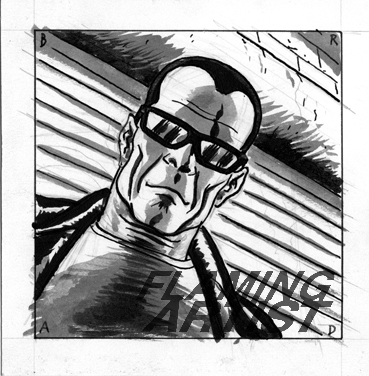
Not much to say here. I started out trying to
fabricate the face and upper body of my “clone of desire”, but found myself
unable to do so. This guy is okay, but I wouldn’t lose any sleep over him. The
dick dangling against his ear is too big, but I needed to get the tip into
position for the guy’s finger and include that man’s knee in the
composition. Compromises had to be made.
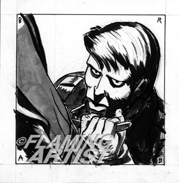
I’m pretty sure this was drawn with a Japanese
Fountain Brush, the kind where one has to squeeze the flexible plastic barrel
to get the ink to flow. In this case, the cartridge was almost empty of ink,
creating a dry-brush effect. I think I was drawing from a photo.
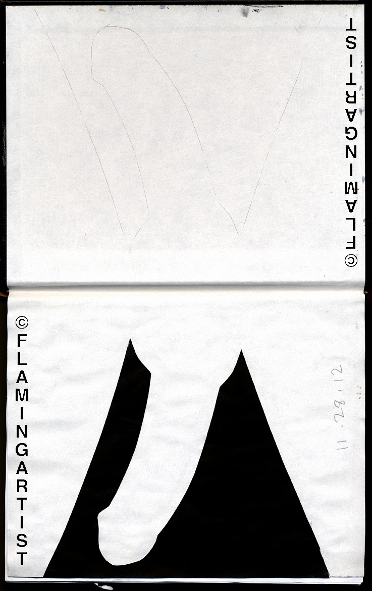
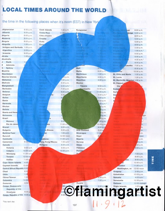
This one is cut paper. It could make a cool logo, with
some refinement. For “The World Wide Federation of Dicks”. Or something like
that.
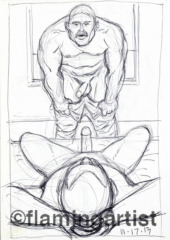
I revisited the subject matter of Wednesday’s post. I
decided a symmetrical composition would be more interesting. The
hands-behind-the-head in the foreground still needs work. Maybe in the next
iteration…
Not much to say on this one.
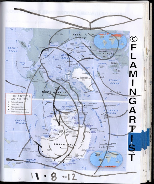
No under-drawing of any kind, just working straight with what looks like a
calligraphic pen using water bases ink—hence the somewhat grayed-out color of
the ink.
It is
interesting for its abstractness, and that it is draw on a page featuring maps
of the North Pole and South Pole. The
bodies to which the two dicks are attached seem to be on opposite sides
of an invisible sphere. I was probably thinking (consciously or not) along those
lines when I drew. My practice, as I did the drawings atop a pre-existing
image, was to stare at the image for a few minutes until I got some sort of
inspiration. Then I would start drawing, usually working quickly and
spontaneously.