Categories
Daily Derrière Uncategorized

Fogtown – pages 42-43

After reading the script, I felt the character called for a beefcake shot. Frank Grissel, the main character, is a closeted, gay-leaning bi-sexual, but his straight side dominates the book.  Based on this character, I asked the editor if I could show Frank’s genitalia. Bob gave the okay, but later recanted. I had to conceal the offending flesh without appearing contrived and prudish.

The gay aspect is much more oblique and left up to the reader’s imagination. This is somewhat frustrating, but appropriate to the time period in the novel.

Categories
Daily Derrière Uncategorized

Fogtown pages 30-31

This is the second appearance of Greg and the first appearance of Jack Kerouac Alley (though one can’t tell from these pages). I had the same problem keeping Greg looking teenaged that I did with the nameless teen whore on pages 6/7. It’s extremely difficult to achieve a consistent likeness of a young, pretty character and avoid having them appear to age when they emote or I use dramatic angles or lighting.

Categories
Daily Derrière Uncategorized

Fogtown pages 22-23

Page 22 is part of the sequence that introduces three main characters: The Blood of the Lamb Ministry (BotLM), Father Fischer, and Greg, a semi-reformed teen hustler. The BotLM building was based on a number of buildings and locations I photographed while researching the North Beach district. Father Fischer is based directly on the author, Andersen Gabrych, at his insistence. (I was more inclined to base Father Fischer on a middle aged Spencer Tracy). Greg is an adolescent version of James Dean.

Andersen originally pitched Fogtown to DC/Vertigo as a 12 issue, regularly formatted mini-series, meaning that it would be 144 regular size pages, averaging six panels per page. They decided to publish the novel through their newly conceived Vertigo Crime imprint. This meant that it would be trimmed to 170 pages, averaging four panels per page. Much expositional information was lost, along with many establishing vistas of the city in transition. When I had to make a choice between the city and the human characters, I usually chose the humans.

Also, the editorial mandate to limit the panel count to four per page sometimes had to be circumvented simply to convey the plot and emotional points Andersen and I were trying to make. Page 23 is a case in point; panels needed to be added simply to explain the characters and milieu.

Page 23 is also exemplary of how my initial attempts to be gestural didn’t serve the artwork. I avoided using a straightedge while inking the Sentinel building, resulting in a distractingly crude look. This was done before I started working with my assistant, Lee-Roy Stephen Lahey, and could assign the drawing of tedious detail to him.

Page 23 introduces Bone, Frank’s rough-trade paramour and (seen in silhouette in panel 8, through the windows of the Cadillac illegally parked next to the hydrant) Bone’s boss, the civic reformer and secret crime boss, Colonel Rupert Thorpe.

Categories
Daily Derrière Uncategorized

Fogtown pages 12 – 13

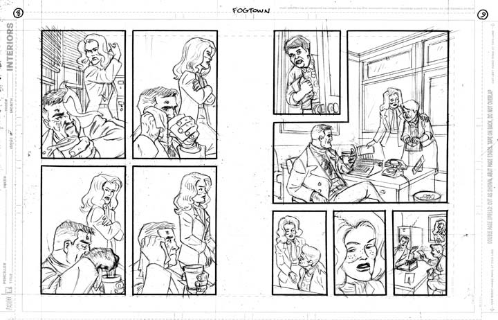
Page 12/13 will be used to explain the creative process for the graphic novel. First I’ll show you the script, then the steps in turning it into graphic novel form.

First comes the script. This is a printout from the relevant page of Andersen Gabrych’s script. Andersen is an up and coming comic book writer (Batgirl, Batman, the Demon), travel writer for LA Confidential Magazine and actor (“Hit and Runway”, “Another Gay Movie”, “Another Gay Movie 2”)

PAGE EIGHT
Panel 1

Loretta hands him the hanky. As he drinks the coffee.

Loretta: Do it yourself then, tough guy.


Panel 2

TENSE SILENCE as Loretta smokes and Frank wipes off his face.


Panel 3

Loretta finally speaks, but doesn’t look at Frank.

Loretta: You didn’t come home last night.


Panel 4

A sudden KNOCK provides a relief for both and their heads turn toward the door.

SFX: KNOCK, KNOCK!


PAGE NINE

Panel 1

The door opens to reveal MAGDA, an adorable little middle-aged Mexican woman. She peaks wide-eyed around the door as she opens it.
Magda: Hello? Senor Grissel?


Panel 2

Frank stays seated. Loretta goes to welcome Magda in.

Frank: Who’s askin’?

Magda: I am Magda. I am look for my daughter. Carmen.

Frank: Well, Magda. She ain’t here.

Magda: No. No. She is go runaway.


Panel 3

Magda looks up at Loretta.

Loretta: Here, please sit down.

Magda: Gracias. You are Senora Grissel?


Panel 4

Loretta’s eyes turn to slits.

Loretta: No. I’m just the secretary.


Panel 5

Magda hands Frank a photograph.
Magda: I bring photo. See?

Frank: Lemme see.

—————————–

I adapted the script, roughing out each page on copy paper, rendering my concept of word balloon and blurb/display copy placement. I then copied both the editor and the writer for their suggestions/ mandates.
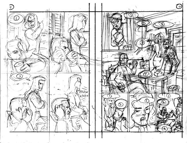
———————-

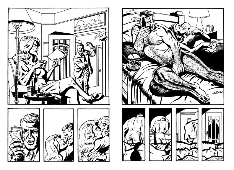
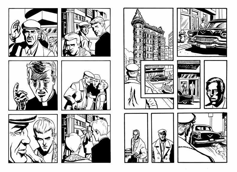
Next is the first pass at finished art, done at the original, smaller size.

Initially, I had been trying for a loose, gestural look. For instance, I opted not to use a straightedge while inking backgrounds, emulating cartoonists like Milton Caniff (“Terry and the Pirates”, “Steve Canyon”), Jordi Bernet (“Torpedo 1936”), and Tony Salmons (“Vigilante”, “The Strange Adventures of H.P. Lovecraft”). I discovered, working in the smaller format, that my results were more sloppily crude than successfully gestural. My editor, Bob Schreck, was also unhappy. We agreed that the remaining 100 pages would be done at the more traditional 14″ x 9″ size. This would achieve a tighter, slicker look.

—————————————–

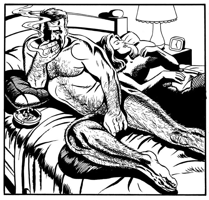
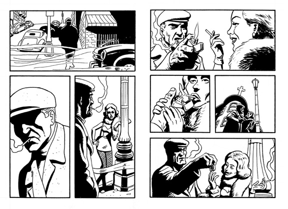
Bob had extensive revision notes on the first 70 pages. I elected to do the alterations in the larger 10″ x 15″ format and composite the fixes using Photoshop. I delivered the finished pages to DC via the Internet, uploading the finished files to DC’s FTP site.

———————————

The production process for mainstream comics is typically an assembly line. One person executes the script, and then various other people provide the pencil artwork, the inked artwork, the lettering, and the coloring (or, in this case, the gray toning). The editor will assign the various chores as s/he feels fit; it’s rare that one artist or creator gets to do all of them on the same project.

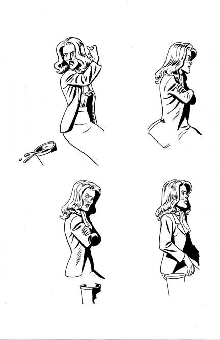
In this case, I was unhappy with the original lettering when Bob sent me the rough lettering pass, in early ’09. I sent a detailed, page by page listing of all the mistakes and lapses in aesthetic judgment I saw. 

Bob left the project soon after and was replaced by the new editor, Will Dennis. Will sent me the pre-publication galley in early ’10. All the elements of the lettering I had objected to were unchanged. I re-sent my critique to Will and he gave me permission to re-letter the display and SFX lettering (I didn’t have the time or ability to re-do the body (balloon) copy and had to let that go). I was not comfortable with Illustrator, the program of choice for letterers, so I hand lettered the re-dos and composited the fixes in Photoshop.

———————————

Now comes the final step before publication, where any mistakes can be caught and last minute changes call be made. The galley was the first time I saw the gray tones, which were executed by Rivkah. Although she was chosen by the second editor on the book, Brandon Montclair, I was happy with her work. She was surprisingly sympathetic with what I was trying to achieve with lighting and mood, and even imitated my brush strokes, leading to a very seamless look. She also avoided glow effects, self-color lines and other excesses allowed too easily by the computer, for which I am extremely grateful.

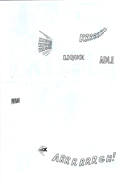
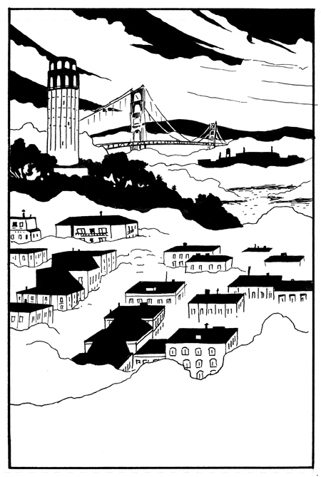
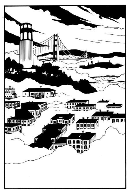
This page is an example of what I changed from the original lettering pass.

Categories
Daily Derrière Uncategorized

Celebrating Fogtown – pages 6 and 7

The prostitute shown here is supposed to be 14 years old. I found it difficult to keep her looking teenaged in the relatively realistic style I was using. It might have been easier if I’d chosen a more cartoony style.

The first 70 pages of the graphic novel were done in the smaller 6″ x 9″, two images per 11″ x 17″ sheet of art paper. This was the format chosen by the publisher, DC Comics, for their new imprint, Vertigo Crime. These books are 8″ x 5 3/8″. Comic books are traditionally 10 1/4″ x 6 3/4″ or 11″ x 8 1/2″. The original art for this larger format tends to be one 15″ x 10″ image on each 17″ x 11″ sheet of art paper. The smaller format for the original art was chosen because of the smaller size of the published work.

These images are from the graphic novel Fogtown written by Andersen Gabrych with art by me, Brad Rader, published by Vertigo/DC. Copyright 2010 by Andersen Gabrych and Brad Rader. Fogtown is available from Amazon.

Categories
Daily Derrière Uncategorized

"Fogtown" published – here's the splash page

CELEBRATING THE RELEASE OF THE GRAPHIC NOVEL “FOGTOWN” PUBLISHED BY VERTIGO/DC — STORY BY ANDERSEN GABRYCH, ART BY YOURS TRULY!

This is the “splash” or opening page to the graphic novel, which takes place in 1953, mostly in the North Beach area of San Francisco, known by its denizens as“Fogtown”, hence the title. It was the concept of the writer, Andersen Gabrych, that the city would be as much a character as any of the people in it.

This was my second pass at the splash page. My editor, Bob Schreck, rejected my first attempt as too crude. I tasked my new assistant, Lee-Roy Stephen Lahey, with enlarging the image from the initial 6”x 9” to 9” x 14” and adding more detail, like such as the bay windows. So this page is very much a collaboration between Bob, Lee-Roy and myself.

Images from the graphic novel Fogtown Copyright 2010 Andersen Gabrych and Brad Rader published by Vertigo/DC – available from Amazon.

Categories
Daily Derrière Uncategorized

I'm Going to Comic-Con!

Hey y’all,
I’m tabling at the PRISM Comics Booth at Comic Con this year. Come check me out.

Categories
Daily Derrière Uncategorized

Drawing of the Day- July 1, 2010

The year is now officially half over. I celebrate with a new drawing.

Categories
Daily Derrière Uncategorized

Eating Out

This is an old convention sketch. I still have the original.

Categories
Daily Derrière Uncategorized

Narcissus